Category Archives: Travel

Make a filmstrip on the scrapbook page

Oh boy, I took one of the new embellishments from this week’s digital downloads for My Digital Studio and used it to make a filmstrip on the scrapbook page!

Candid Frame filmstrip

Candid Frame filmstrip

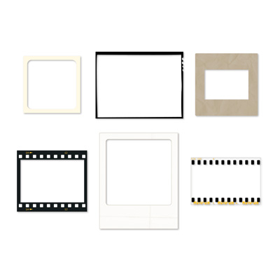
The download set is called Candid Frames and it has six embellishments that look like various picture formats.  These are the types of film or picture images that are included:

  • a snapshot,
  • a vintage picture,
  • a slide holder,
  • a film frame,
  • an instant picture (like a Polaroid picture),
  • or a 35mm format (the one I used!).
129929 Candid Frames - Digital Download

129929 Candid Frames - Digital Download

These are so easy to dress up your page – just add the embellishment on top of the picture, and adjust the sizes.  The embellishments are clear so you can see whatever is underneath them in the middle!

For this page, I simply used one of the basic templates for a 12 x 12 scrapbook page that has three pictures and a text box underneath.  Here’s all I had to do to make this cute page:

  • I dropped in the pictures,
  • added one of the Candid Frames – 35mm embellishments on top,
  • resized it to cover the pictures,
  • copied the embellishment and pasted a second copy, then aligned them by selecting both embellishments and using the Align Image button on the top
  • I added the text into the text box and increased the font to 16, bold,
  • I added a text box for the headline across the top and changed the font to Bauhaus 93, size 64 bold.
  • I added the Open for Trade – Photo Log stamp from the prior week’s downloads to make it look more like a photograper’s proof sheet and added text boxes for the location, etc.

And that’s it!  Clean, simple, graphic and fun.  I love it!  What do you think?  You can get the downloads from my online store, and then you too can make a filmstrip on the scrapbook page!

Check This Out: new photo box punches in My Digital Studio!

Check This Out: new photo box punches in My Digital Studio!  The new digital download template called Check This Out (129921) has something I’ve been waiting for: rounded edge photo box punches!  You can use the designer layouts with the template pages, or use the punches wherever you want.  Check This Out! (literally!).

Here is a snapshot of the 6 template pages that come with the Check This Out! download:
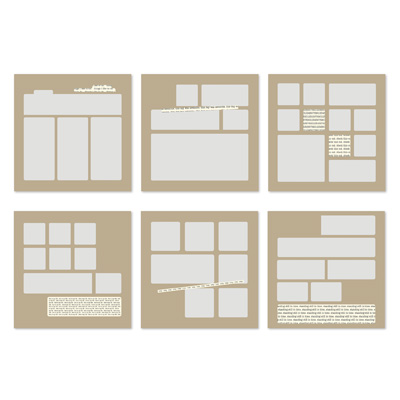
129921 Check This Out Designer Page Template

129921 Check This Out Designer Page Template

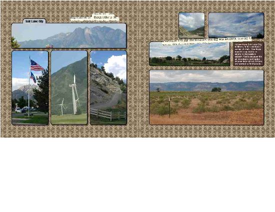
It also includes 7 embellishments and 17 photo box punches of various sizes and shapes, with cool rounded edges.  But the greatest thing is that you can fill these cool punches with a picture!  Check out the pages I made for my Utah trip album, and I will tell you how to do it below.  Just a simple trick!
Check This Out template - basic

Check This Out template - basic

For the two pages above, I just used the first two page templates as is, changed the background to Mocha Morning DSP (129008) and dropped pictures into the photo box punches.  Wait, you say!  How do you do that?  It’s easy!

There is an option to do a “Replace Image” on a punch… but in order for the button to appear, you need to have filled it with an image before you can replace it!  Here’s what to do:

  1. Add a punch to the page, or select a punch on the template
  2. Fill it with a Designer Series Paper (any one – it doesn’t matter)
  3. Double click on the punch shape, bringing up the Punch Image Editor box
  4. Select the “Replace Image” button, bringing up the browse screen where you can select the name of the folder that has the picture you want to use
  5. Click on the picture, bringing up a preview on the right (hint: it helps to know which picture you want ahead of time!)
  6. The picture fills the punch shape in the Punch Image Editor box, and you can move the punch shape around to select the part of the picture that you want.

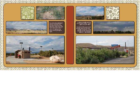
Cool, huh? For the next two pages in the album, I modified the template pages:
Check This Out template - custom

Check This Out template - custom

Here’s how I did it:

  • I started on the left page, using the same template from the right hand page in the first set, and filled the background paper with a Spice Cake Designer Series Paper (125610).
  • I added one of the rounded punch shapes from the Check This Out download, stretched it to cover most of the page and to extend off the right side of the page (so that the rounded corners wouldn’t show).
  • I sent it to the back layer (using the Change Object Layer icon on the top) and filled it with More Mustard to match the scenery.
  • I added the vertical shape in the middle of the pages, then stretched and positioned it off the page in the same way, and color filled it with Cajun Craze.
  • I saved the project, then went down to the bottom of the screen and right clicked on the page.  I chose “Insert Duplicate Page Mirrored”.
  • This gave me the same page, in reverse, but the best part is that the two punches that extend across the center edges of the page line up correctly!

So I filled the background and punch shapes with pictures and Spice Cake DSP (125610), and added text boxes on top of some of the punch shapes. Ta da!  I really like the simple graphic layout, as it reminds me of some of the cave paintings that I saw out in the mountains.  But, more to come about that in a future post!

If you also love this template and the cool punch shapes, you can download it right now!  Go to my online store, and if you do it this week you just have to select it from the current week’s digital downloads shown on the right.  Or, simply search for Check This Out (129921)!  Add it to your cart, download, and use it right away!

Tell me what you think of this cool tip using Check This Out: new photo box punches in My Digital Studio!

How to save money as you crop and enlarge your pictures with My Digital Studio

Here’s how to save money as you crop and enlarge your pictures with My Digital Studio!  Doesn’t that sound great?

Have you ever taken a picture into the photo store to be enlarged for a scrapbook layout?  It can cost $5 or $10 just for a 5 x 7″enlargement – and that is if you are simply enlarging the whole picture.  You may need to pay extra to get them to zoom in on a particular part of the picture, cropping out the rest!

I love using My Digital Studio for my digital scrapbooking, and one of the biggest reasons is that I can crop and enlarge pictures on the fly!  No waiting, and no big expense!  Let me show you two examples:

1) Giant size pictures (LOL)

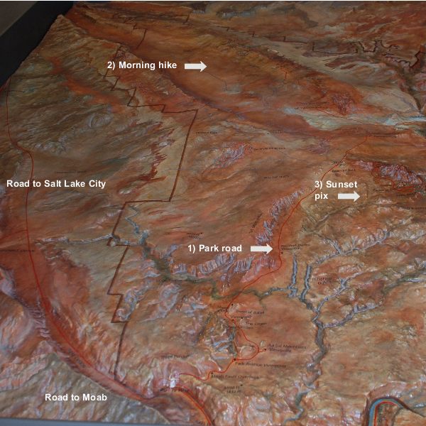
Here are two pages that I made about my trip to Utah this past summer, where I went hiking in Arches National Park.  In the Visitors Center, I took a picture  of this cool 3D topographical map, and then blew it up to giant size so I could add labels for the different areas that I hiked and visited!  I made it so big that I had to split it between two pages, so here is the left page and then the right page:

My Digital Studio photo enlargement layout - left page

My Digital Studio photo enlargement layout - left page


My Digital Studio photo enlargement layout - right page

My Digital Studio photo enlargement layout - right page

Isn’t that cool?  Just imagine how much it would have cost to make TWO 12 x 12″ enlargements of the same picture for this layout!  And, I was able to add captions right on top of the picture to match my journaling on the right.

2) Zooming in on a picture

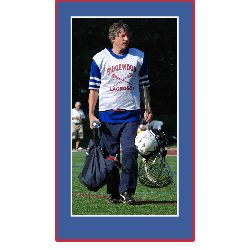
My hubby coaches 8th grade boys lacrosse, and he played in the “Old Goat” game with a bunch of the other alumni and coaches.  Well, I got a great picture of him after the game, but you probably know how big those playing fields are… even with my good Nikon camera and a good zoom lens, I can’t zoom in on just one person from across the field!  Take a look at the difference it makes when I zoom in and crop the picture using My Digital Studio.
Basic photo:
Hubby's full picture

Hubby's full picture

And here is what the picture looks like when I zoomed in on him, cropping out the distracting stuff on the sides:

Cropped photo with triple mat

Cropped photo with triple mat

POW! my eye focuses on him (and he is indeed a handsome fellow, yes?).  I quickly added a white mat around the picture, then inserted a square punch behind it, stretched it to the right size, colored it Pacific Point blue and matted a red mat on the punched shape for a triple mat.  All in about 60 seconds!  And note – if there was not already a Stampin’ Up! color that matched his uniform, I also could have made the punched mat exactly match a color in the picture!

Can you think of some scrapbook pages you have done where this would have been useful?  I bet you’re happy that you see how to save money as you crop and enlarge your pictures with My Digital Studio!

My Digital Studio for travel

I’ve been posting about all the problems you may have with scrapbooking that can be solved by using My Digital Studio, and here are a couple more reasons why I love my Digital Studio for travel!

Problem #7

I need a hobby that is portable – I travel a lot for business and have lots of time in the hotel with nothing to do.

Solution:

Put My Digital Studio on a laptop and GO!  Of course, if you use a laptop from work, be sure to ask whether you can add outside software to it.

And if you travel on vacation but have little kids who go to bed early, bring your own laptop from home and scrapbook your vacation pictures at the end of the day, while the little ones are sleeping!  That’s what I did during my solo trip to Utah for Convention this summer, since it was TOO HOT to be outside in the afternoon… I took a little My Digital Studio break!  See my previous post here.

Journaling on my scrapbook pages

I have a confession about the journaling on my scrapbook pages that I hinted on Wednesday that I was going to share… I don’t like my handwriting!

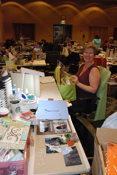
Here’s the picture from the last post that started this off… it shows my friend Pat, who sat next to me at the last NJ Crop Weekend.

My friend Pat at the Fall 2011 NJ Crop Weekend

My friend Pat at the Fall 2011 NJ Crop Weekend

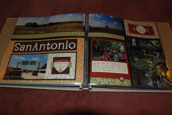
And do you see the scrapbook page about San Antonio that was in progress
at the foreground of the picture?  I was working on our Texas vacation pictures
that weekend.  Here’s how the following set of the finished pages turned out:

San Antonio pages

San Antonio pages

I used a variety of the Spice Cake Designer Series Paper, since the  colors really seemed to match the subject – and of course they are all color coordinated with each other and with the Stampin’ Up! cardstock and ink colors, making life really easy for me to piece together this quilt style scrapping!  I added strips of the 3/8″ Quilted Satin Ribbon to separate the rectangles on the page.  I love how it came out!

But here’s the confession that I want to point out about pages – notice the journaling that I hand wrote on the bottom right.  I have to tell you that I really, really do not like my own handwriting.  This is not an issue when I do a lot of my scrapbooking in My Digital Studio and just type my journaling messages.  But, when I do paper scrapping, I make myself hand write it – for many reasons:

  1. I find that I can wind up spending TOO much time on a set of pages
    if I get too crazy making the journaling look perfect.  I get involved with creating a document to type the journaling, then worry about the size and shape it will wind up to be, the font size, alignment and so on…
  2. Focusing on the appearance of the journaling makes me lose track of what I am actually saying – kind of a form over function thing, I guess!
  3. I also think it is really important to make the pages more “organic” and accessible by including the personal touch of my own handwriting.
  4. Our writing changes over time, and years from now it will be great to look back on these pages and see what it looked like now!

Now don’t get me wrong – there are some times when I am doing a hand made page, and I will go to My Digital Studio and print out a title in the correct matching color for the page… but I no longer go out of my way to omit my handwriting from journaling on my scrapbook pages!


I’m back! Did you miss me?

Well, the last time I posted was when I was returning from the Stampin’ Up! convention in Utah.  I took a little time with the family, and then got sucked right into marching band stuff with my daughter!  I chaperoned band camp, which occured during Hurricane Irene, leaving us stuck at camp with 89 teenagers and no power for three days.  The kids were terrific, the staff and fellow chaperones were terrific, but boy was I glad to get home and get a shower!

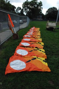
Then upon arrival home I got busy helping to sew flags for the marching band color guard.  The show this year is Tommy, and we made three different flags… all with difficult circles and silver lame fabric.  The eleven flags that I made had nine appliques EACH and took a ton of time to sew.  Truly a labor of love!  Check out the Pinball flags below.

Pinball flags

Here are the eleven Pinball Wizard flags I made!

So, suffice it to say, I have been a bit distracted from scrapbooking and card-making… but gee, I have about two thousand pictures from the trip to Utah, and marching band so far, that are calling to be scrapbooked!  I’ll keep you posted! and share some fun stuff as I go along.

Picture me having fun at convention!

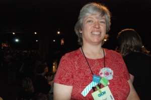
No seriously… here are pictures of me having fun at at convention!  This is one of the General Sessions where they addressed all 3,500 of the attendees.  They had big screens set up so that everyone could see!  And check out the bling on my lanyard – we get pins for various stuff we do, and the colored strip shows if we have won something from the prize patrol.

Carol at Convention

Carol at Convention during the General Session.

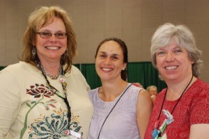
Carol and friends at convention

Here I am on the right, with my friends Kari and Jen

Lost in the maze – surrounded by card and scrapbook layouts!

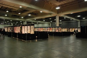
Three of my demonstrator friends went in and have not been seen for hours!  Take a look at the walls of samples that are on display for us here at the Stampin’ Up! Convention.  It is absolutely overwhelming! 

Stampin' Up! sample boards at convention 2011

Sample boards at the 2011 Stampin' Up! convention

I’ll show you more when I can get the pictures sorted out.  They are keeping us really busy every day!  I can’t wait for the morning – I will be taking an upper level class on using My Digital Studio.

Oh and by the way – we finally found those three demos.  They came out of the maze when their cameras could not hold any more pictures!

Scrapbook title page updated – fast & easy!

Remember the title page that I showed the other day?  well, that was the first version – took only 10 minutes while housekeeping was tidying the hotel room at the lodge.  But I thought it looked a little flat so I played with it a bit!   What do you think of this version?  I changed the background paper and added a border around the page to tie in with the mat on the star.  And tweaked the colors a bit.  While it is basically the same, I think the added contrast gives it more “oomph” and makes it pop some more.

Updated title page

Here is the updated title page - it was easy to change colors & paper in My Digital Studio!

I am now in Salt Lake City at the hotel, waiting for my buddies to get here from New Jersey… convention starts tomorrow!  It’s pretty funny to sit here in the lobby as I post this… there are 500 women staying at this hotel alone!

I made some cards to swap with folks – will show in a future post!

Scrapbook on your own terms!

Have you ever wanted to scrapbook something that just happened, but you feel you can’t because you haven’t finished your first child’s baby pages yet?  and your child is 19 (like mine)?  Don’t feel concerned that you need to scrapbook chronologically.  You can work on current pages whenever the mood strikes you! and you will have the advantage of remembering how you felt when the pictures were taken.

I have so many pictures already in the queue to scrapbook at home… but I already started making some pages while on vacation because I am loving the pictures I am taking! (hint: I am using My Digital Studio, and the software license allows you to put it on two computers… so, I have it on my laptop that I brought with me!).

Today, I was resting in my room during the heat of the day.  When the maid service came by to tidy up the room (LOVING this!) I grabbed the laptop and went to hang out in the cowboy style lounge here at the lodge… and made a scrapbook page!  It’s the cover to the album of this trip.  I may completely change it, but hey, it took 10 minutes!

Utah 2011 album

My scrapbook cover page