Tag Archives: scrapbook pages

Sunday Journal – Journaling without any actual pictures Post #2

Welcome to our ongoing discussion of Journaling without any actual pictures Sunday Journal Post # 2: Put a Tiger in Your Tank!

Last week, I started writing about how Sunday Journal scrapbook journalingto make your journaling the star of the page when you don’t have any actual pictures of the event or memory.  In that post, I showed an example of using a current day picture to supplement the journaling and evoke the image – a picture of my current lawn was added to my journaling about sitting and playing in the lawn when I was a kid.

This week, I’d like to discuss another way to supplement your journaling on your scrapbook page: finding someone else’s pictures!  There are zillions of pictures available on the internet, and the odds are that you can find an authentic picture to match what your words are saying in your journaling.  The key thing that you need to do is be sure you are not violating someone’s rights to the picture by using it.

Here are some ways to find a picture:

  • Google or yahoo search for the topic,
  • eBay for pictures of vintage items,
  • sites that sell antiques (if you’re as old as I am, LOL),
  • BigStockPhoto.com – you may need to pay $1 for a picture but you can get all sorts of images with no worry about copyright infringement!

Sometimes it is a logo or advertising slogan that brings back a flood of memories for you.  Here’s an example of a page I made, continuing the theme about Summer Days When I Was Young, where the slogan Put A Tiger in Your Tank really summed up a lot of what I remembered!

Put a Tiger in Your Tank

Put a Tiger in Your Tank

I made the page using My Digital Studio, starting with one of the plain photo template page layouts. While I didn’t have any tiger images to add to the background, I am kind of pleased at how the combination of the orange background and the layers of zig-zag stitching give a subtle evocation of tiger stripes and support the journaling.

And I like having key elements repeat in threes.  The most vivid element to me is the red & blue Esso sign (anyone else ‘member them?!) so I added the red & blue highway sign from Rt 81 (we lived in New York State so my dad drove us on that highway a LOT!).  Then for the third splash, I made the “Put a Tiger in the Tank” headline the same colors by using the color picker tool to match the Esso sign.  Cool, huh?!

Next week’s post: Using song lyrics for journaling without any actual pictures

So what do you think?  I know Tony the Tiger was from Frosted Flakes, but do you think he would like this journaling page about his cousin that I made by journaling without any actual pictures of my childhood?

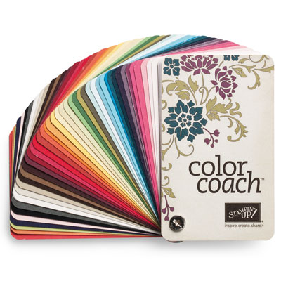
Color Coach makes you a star!

I posted about all of the new Stampin’ Up! 2012-2014 In Colors last week, and I mentioned that I was going to tell you about the Color Coach; what I really want to do is tell you how the Color Coach makes you a star!

Do you find yourself using the same basic color combinations, perhaps because it’s scary or too much work to try something new?  Color Coach to the rescue!

120148 Color Coach English

120148 Color Coach English

What on earth is it, you ask?!  It’s a series of cards put together on a rivet, like one of the My Digital Studio swatchbooks that you can have professionally printed by Stampin’ Up!  Each card has two sides:

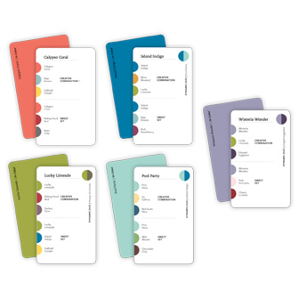
  1. One of the great Stampin’ Up! colors is on one side, so that you can hold it up to your paper project and see how the color will look – without having to go find a piece of card stock that color.  Very convenient!
  2. The other side has two sets of color combinations: a Creative Combination, showing 2 colors that work creatively with the color you are considering using, and the Sweet Set, a slightly different combination of colors that will also look great together but with a sweet and pretty type of style.

Using the color combinations that are suggested by the cards can open your eyes to a new look or style, and get you out of a rut you may have fallen into on your projects – without noticing!

The Color Coach makes you a star in the digital world as well!  I find it is easier to try new color combos using My Digital Studio than in traditional paper crafting.  Let’s face it, if you don’t like the colors together, just hit the “Undo” button!  But there are so many possible combinations that I also turn to the Color Coach just for a jumpstart of some suggestions.  And hey, if I don’t like them on the project – UNDO!!

Another really cool thing about the Color Coach is that there are add-on packs of cards for each new year’s In Colors.  They are worth having, to learn how the new colors fit into our existing color palette.  And don’t forget – the In Colors are around for a full two years – and they will NEVER go away in My Digital Studio!

124886 Color Coach - 2011 In Color Cards - English

124886 Color Coach - 2011 In Color Cards - English


126890 2012 In Color Color Coach Cards English

126890 2012 In Color Color Coach Cards English

You can get your Color Coach (121046) by visiting my online store, and be sure to add in your 2011-13 In Color Cards (124886) and the NEW 2012-2014 In Color Cards (126890) as well.  And then YOU can see how the Color Coach makes you a star!


Make a filmstrip on the scrapbook page

Oh boy, I took one of the new embellishments from this week’s digital downloads for My Digital Studio and used it to make a filmstrip on the scrapbook page!

Candid Frame filmstrip

Candid Frame filmstrip

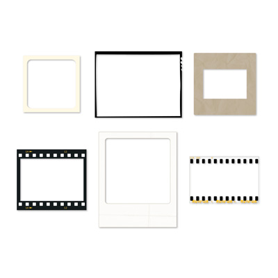
The download set is called Candid Frames and it has six embellishments that look like various picture formats.  These are the types of film or picture images that are included:

  • a snapshot,
  • a vintage picture,
  • a slide holder,
  • a film frame,
  • an instant picture (like a Polaroid picture),
  • or a 35mm format (the one I used!).
129929 Candid Frames - Digital Download

129929 Candid Frames - Digital Download

These are so easy to dress up your page – just add the embellishment on top of the picture, and adjust the sizes.  The embellishments are clear so you can see whatever is underneath them in the middle!

For this page, I simply used one of the basic templates for a 12 x 12 scrapbook page that has three pictures and a text box underneath.  Here’s all I had to do to make this cute page:

  • I dropped in the pictures,
  • added one of the Candid Frames – 35mm embellishments on top,
  • resized it to cover the pictures,
  • copied the embellishment and pasted a second copy, then aligned them by selecting both embellishments and using the Align Image button on the top
  • I added the text into the text box and increased the font to 16, bold,
  • I added a text box for the headline across the top and changed the font to Bauhaus 93, size 64 bold.
  • I added the Open for Trade – Photo Log stamp from the prior week’s downloads to make it look more like a photograper’s proof sheet and added text boxes for the location, etc.

And that’s it!  Clean, simple, graphic and fun.  I love it!  What do you think?  You can get the downloads from my online store, and then you too can make a filmstrip on the scrapbook page!

Journaling about your holiday decorations

This week’s Sunday Journal post covers journaling about your holiday decorations!

Sunday JournalWell, the holidays are over and many people have either already taken down their decorations, or are planning (or dreading) to do it!  But I suggest that if you still have holiday decorations around the house, you can take a look at them and consider the story (or stories) that they tell.  Think a little bit about them.  Consider:

  • Why do you put out these things in your home?  do they say something about you or your family (for example, quirky or goofy decorations can reveal your fun side; a snowman collection can reflect upon times that you enjoyed as a child)
  • Look at a specific item – Where did it come from? was it a gift, or was it passed down from family? does it make you remember someone special, or a special time?
  • Is there a religious connection with your holiday decorations? this might be a way to record some of your beliefs so that you can share them with your family and friends.  What is the significance of a particular item to your religious or cultural group?
  • Is an item part of a tradition that you do every year? tell about it!

Once you have pondered some of these ideas, think about how to get the ideas you like onto a page.

  • You can include a picture of select items and write a few lines or a little story about each, and lay out the page as if it were a series of encyclopedia entries.
  • Or include a large picture of your home, decorated for the holidays, and add a few lines or paragraphs to explain some of the things you came up with while doing the thinking exercises above!  If you want to refer to specific items in the large picture, try adding numbered arrows that correspond to numbered reflections on the side or bottom of the page.
  • If certain items were a gift from a treasured friend or family member, you can add a picture of the person along with the item!
  • If you grew up with a particular decoration, tell how it was used when you were a child.

So many great thing to consider when you are journaling about your holiday decorations!

Journaling on my scrapbook pages

I have a confession about the journaling on my scrapbook pages that I hinted on Wednesday that I was going to share… I don’t like my handwriting!

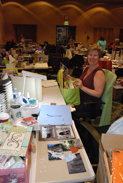
Here’s the picture from the last post that started this off… it shows my friend Pat, who sat next to me at the last NJ Crop Weekend.

My friend Pat at the Fall 2011 NJ Crop Weekend

My friend Pat at the Fall 2011 NJ Crop Weekend

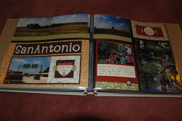
And do you see the scrapbook page about San Antonio that was in progress
at the foreground of the picture?  I was working on our Texas vacation pictures
that weekend.  Here’s how the following set of the finished pages turned out:

San Antonio pages

San Antonio pages

I used a variety of the Spice Cake Designer Series Paper, since the  colors really seemed to match the subject – and of course they are all color coordinated with each other and with the Stampin’ Up! cardstock and ink colors, making life really easy for me to piece together this quilt style scrapping!  I added strips of the 3/8″ Quilted Satin Ribbon to separate the rectangles on the page.  I love how it came out!

But here’s the confession that I want to point out about pages – notice the journaling that I hand wrote on the bottom right.  I have to tell you that I really, really do not like my own handwriting.  This is not an issue when I do a lot of my scrapbooking in My Digital Studio and just type my journaling messages.  But, when I do paper scrapping, I make myself hand write it – for many reasons:

  1. I find that I can wind up spending TOO much time on a set of pages
    if I get too crazy making the journaling look perfect.  I get involved with creating a document to type the journaling, then worry about the size and shape it will wind up to be, the font size, alignment and so on…
  2. Focusing on the appearance of the journaling makes me lose track of what I am actually saying – kind of a form over function thing, I guess!
  3. I also think it is really important to make the pages more “organic” and accessible by including the personal touch of my own handwriting.
  4. Our writing changes over time, and years from now it will be great to look back on these pages and see what it looked like now!

Now don’t get me wrong – there are some times when I am doing a hand made page, and I will go to My Digital Studio and print out a title in the correct matching color for the page… but I no longer go out of my way to omit my handwriting from journaling on my scrapbook pages!